
-
Your Responses - Share & Have Fun :)
-
-
 I'll try it again. On display and did not want to get off the side of the road!
 -
-
-
-
-
On display and did not want to get off the side of the road.
-
No, it is the underside of a bridge, but it does kind of look like an aqueduct.
-
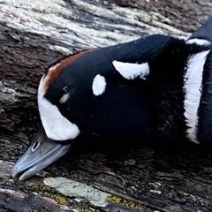
They’re cool… right up until they wipe out a good panfish population.
-
-
-
Topics
-


Recommended Posts